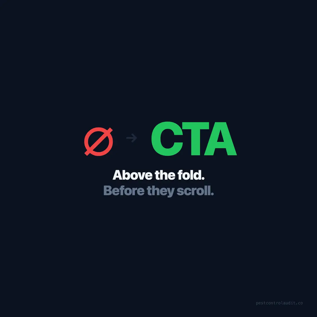
Add a CTA Above the Fold (With Examples)
21% of pest control websites have no CTA above the fold — 319 sites making visitors scroll to take action. Here's what to add and where.
A homeowner in Phoenix finds a scorpion in her bathroom. She searches “pest control Phoenix” on her phone, taps the first result, and sees: a large logo, a stock photo of a green lawn, the words “Committed to Excellence Since 2009,” and nothing else above the fold. No phone number. No button. No way to take action without scrolling.
She taps back. The second result opens with “Scorpion Treatment — Same Day — Call Now” and a bright green button. She taps the button and books an inspection in 45 seconds.
21% of the 1,537 pest control websites we audited have no call-to-action above the fold (Pest Control Audit, 2026). That’s 319 companies where the first screen a visitor sees offers no way to convert. The visitor has to scroll past the hero section, past company history, sometimes past an entire services grid — just to find a phone number or a “Contact Us” link.
In pest control, the visitor is often dealing with an urgent, unpleasant problem. She doesn’t want to browse. She wants to act. If the action isn’t visible in the first three seconds, she leaves.
What “above the fold” means on mobile
Above the fold is everything visible on the screen before the visitor scrolls. On a desktop monitor, that’s roughly the top 600–800 pixels. On a phone — which accounts for over 60% of all web traffic (Statcounter, 2025) and an even higher share for local service searches — it’s the top 500–650 pixels.
That’s not much space. A large logo, a hero image, and a headline can consume the entire above-fold area on mobile. If your CTA lives below any of those elements, it’s below the fold — and a significant percentage of visitors will never see it.
The average pest control website scores 21 out of 100 (Pest Control Audit, 2026). Sites in the bottom half of our scoring typically have hero sections filled with imagery and slogans. Sites in the top quarter have hero sections built around a single action: call, quote, or schedule.
The three CTAs that work for pest control
Not every CTA performs equally. Based on the highest-converting sites in our dataset, three types consistently outperform everything else.
CTA 1: Click-to-call button
The most direct conversion path. A large, high-contrast button that says “Call Now” or “Tap to Call” with a tel: link. On mobile, one tap opens the dialer. On desktop, it triggers the default calling app.
Why it works: The visitor with a pest emergency wants to talk to someone now. A phone button with the number visible — “(407) 555-0199” — removes every barrier between “I need help” and “I’m calling.”
20% of pest control sites have non-clickable phone numbers (Pest Control Audit, 2026). A CTA button with a working tel: link solves two problems at once: it creates an above-fold action and makes the phone number functional.
CTA 2: “Get a Free Quote” button
For visitors who aren’t ready to call — because they’re at work, it’s late, or they prefer forms — a quote button is the alternative. The button should link to a form, either on the same page (scroll to the form section) or in a modal overlay.
Why it works: It promises something free and useful. “Get a Free Quote” outperforms “Contact Us” because it sets an expectation: the visitor will receive something of value, not just send a message into the void.
CTA 3: “Schedule Service” button
For companies with online scheduling (through ServiceTitan, Jobber, or similar), a scheduling button above the fold is the highest-value CTA. The visitor can book without calling, without waiting for a callback, without any friction.
Why it works: Instant gratification. The visitor goes from “I have a pest problem” to “my appointment is booked” in under two minutes. No phone tag, no waiting.
Before and after: what the change looks like
Here’s the typical above-fold layout on a site scoring below 20 in our audit:
Before (low-scoring site):
- Large logo (80px height)
- Full-width hero image (stock photo of a house)
- Company tagline: “Your Trusted Pest Control Partner”
- No phone number visible
- No button visible
- CTA appears 1,400 pixels down the page
After (optimized):
- Compact logo (40px height)
- Hero headline: “Pest Problems? Same-Day Treatment from $89”
- Trust bar: “4.8 stars | 350+ reviews | Licensed & Insured”
- Two buttons side by side: “Call (407) 555-0199” and “Get a Free Quote”
- All of this fits in 500 pixels on mobile
Same company. Same brand. The difference is what occupies the most valuable real estate on the page. The optimized version puts the action first and the branding second.
CTA design rules that matter
The difference between a CTA that converts and one that gets ignored often comes down to design decisions, not copy.
Contrast is non-negotiable
The button must visually stand out from everything around it. If your site is white and gray, the CTA should be a strong color — red, green, orange, or blue. If your site uses a dark background, a bright button works. The CTA should be the single most visually prominent element on the first screen.
Size matters on mobile
A CTA button on mobile should be at least 44px tall (Apple’s minimum tap target) and ideally 48–56px with generous padding. Buttons smaller than that cause mis-taps and frustration. The visitor tapping “Call Now” while stressed about a pest problem doesn’t want to tap twice.
Two CTAs are better than one
The best-performing pest control homepages we’ve audited offer two CTAs side by side: one for calling, one for a form or quote. This covers both visitor types — the person ready to talk now and the person who wants to submit a request first.
“Call (407) 555-0199” | “Get a Free Quote”
Both above the fold. Both high-contrast. The visitor chooses the path that fits her situation.
CTA copy: specific beats generic
“Contact Us” is vague. “Get a Free Quote” is specific. “Call for Same-Day Service” is the most specific. The more the CTA tells the visitor what happens after they click, the more likely they are to click.
Weak: “Learn More” / “Contact Us” / “Submit” Strong: “Call Now for Same-Day Service” / “Get Your Free Quote” / “Schedule an Inspection”
CTA placement on service pages and blog posts
The homepage hero isn’t the only place CTAs matter. Every page on your site should have at least one clear action.
Service pages (termite, rodent, ant, etc.): CTA at the top (above the fold if possible) and at the bottom. The visitor who scrolls through your entire termite treatment page and reaches the end is interested. Give her a button right there.
Service area pages: CTA in the hero and a phone number in every section. 22% of pest control sites have no service area pages (Pest Control Audit, 2026). If you’re building them, bake in the CTA from the start.
Blog posts: A CTA in the sidebar (desktop) and at the end of the post (mobile). The visitor who reads an entire blog post about ant treatment is a warm lead — make the next step obvious.
Pricing page: CTAs next to every price. “Starting at $149” should be followed immediately by “Schedule Treatment” or “Call for Your Quote.” 35% of sites have no pricing page (Pest Control Audit, 2026). The ones that do should pair every price with an action.
The “no CTA” penalty is real
When we compare sites with above-fold CTAs to sites without them, the score difference is stark. Sites with a CTA above the fold average 38 out of 100 in our scoring. Sites without average 11 (Pest Control Audit, 2026).
That’s not just because of the CTA itself — it’s because the CTA signals a conversion-oriented mindset. Sites that bother to put a call button above the fold also tend to have clickable phone numbers, contact forms, pricing, and schema markup. The CTA is the tip of the conversion iceberg.
Sites without above-fold CTAs tend to be the ones with everything else missing too. They’re brochure sites — informational but passive. They tell you what the company does but never ask you to take action. And in an industry where the visitor has an active pest problem and wants to solve it now, passive websites lose every time.
How to add a CTA above the fold in 30 minutes
Step 1: Identify your hero section. Open your homepage. What’s visible on a phone screen before scrolling? If it’s just a logo, image, and tagline, that’s what needs to change.
Step 2: Add a headline that references the visitor’s problem. “Pest Problems? Same-Day Treatment from $89.” This replaces “Welcome to [Company].”
Step 3: Add two buttons. One click-to-call, one for a form. Use contrasting colors. Make them at least 48px tall on mobile.
Step 4: Add a trust bar. One line: “4.8 stars | 350+ reviews | Licensed & Insured | Same-Day Service.” This fits between the headline and the buttons.
Step 5: Test on your phone. Open the page. Can you see both buttons without scrolling? Can you tap the phone number and it dials? If yes, you’re done. If not, reduce the logo size or hero image height until the CTAs are visible above the fold.
Total time: 30 minutes on most website builders. No developer needed. The 319 sites without any above-fold CTA (Pest Control Audit, 2026) could fix this before lunch.
The median pest control website scores a 5 out of 100. Don’t be the median. Put the action first.
Keep reading
Want to know your score?
Drop your URL — full report in 48 hours.
We're on it.
Report in your inbox within 48 hours.